Burndown Charts in Scrum - Using Them to Your Advantage
While officially not part of Scrum, sprint burndown charts are often used to track progress in sprints. They are an easy way for agile and Scrum teams to see at-a-glance how work is going during a sprint. Burndown charts are also a helpful tool for Scrum Masters to use when looking for team patterns and opportunities for improvement. To understand how burndown charts work, it’s helpful to walk through a few sample burndown charts. Please note, burndown charts are no longer officially part of Scrum.
Scrum Team Struggling to Finish

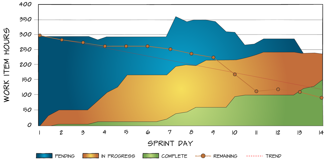
We can see in this example there are several risks. First, notice that pending work (highlighted in grey) is increasing around the middle of the sprint. This means that the team is either taking on new work or the work they have in place was not estimated or broken down very well.
Second, notice that the work in progress, highlighted in yellow, is increasing almost to the last day of the sprint. This means that the team is taking on more work than they are finishing.
Lastly, note that although the development team originally committed to nearly 300 hours of work, they only finished half that (the green area on the chart). A good Scrum Master will help the team see these issues and get them fixed so the team can get on its way to being high performing.
Scrum Team Performing Well
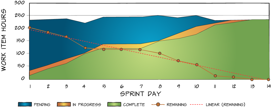
 In this burndown, things are better. The pending work stays relatively flat, the work in progress is small, indicating there was thought put into place on the tasks needed to accomplish the stories, and the task sizes are small. Last we can see the team finished their work. These are typical results after two to three months of a team being together.